Saturday, 30 March 2013
Friday, 29 March 2013
Wednesday, 27 March 2013
Tuesday, 26 March 2013
Monday, 25 March 2013
Sunday, 24 March 2013
Evaluation Question 1
1. In what ways does your media product use, develop or challenge forms and conventions of real media products?
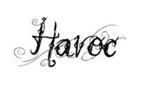
Throughout my magazine, I have stuck to and followed conventions of traditional magazines. I think this is shown particularly on the front cover, where I have used aspects such as coverlines and taglines, as I have used a similar style to that of real life magazines I have researched (for example Kerrang! Magazine). With my masthead design I have tried to reflect characteristcs of the magazine's genre, in the sense that the rugged, rough nature of the font reflects the heavier nature of the music feaured, and the fact that the masthead is simply one sohrt, impacting word also helps to reflect the musical styles featured, as the characteristics of many of the artists featured are such that the musical elements used are simple riffs or recurrent phrases which are deliberately simple to create a larger impact on the audience.
Whilst researching these magazines, specifically magazine covers, I have focused on the layout in particular, and used a similar layout to that of an issue of NME I analysed. The main aspect I have taken from this magazine is the main image, and rather than simply replicate this image I decided to vary it, as this magazine (and many other magazines like it) focus on a large, centered main image which is a close up shot of a band member, or usually frontman. I have taken inspiration from this, but rather than have a close up shot on my magazine, I have decided to have a medium range shot of a frontman performing, an edit of a photo I took whilst at a concert. The face is almost blacked out, and the whole image is edited in black and white. I decided to do this as it sets up the style for the rest of the magazine, and I think when viewed alongside the rest of the magazine this works really well, and also links in with the feature article, which is based on a Young Guns, a band who’s image and overall sound is particularly dark, and their album covers/videos tend to be shot in black and white, so fans or readers familiar with the band will be able to relate to this overall style.
Editing and cropping main image:


Editing images for contents. I wanted to bring a more modern feel to the magazine, so i decided to create a list for this page, and then edit it with photoshop, rather than use a standard layout of page reference
Original image:

Cutting out and adding in titles to image:

Placing text behind image:

Finished image:

Adding in borders to highlight against background of contents page:

Throughout my magazine, I have stuck to and followed conventions of traditional magazines. I think this is shown particularly on the front cover, where I have used aspects such as coverlines and taglines, as I have used a similar style to that of real life magazines I have researched (for example Kerrang! Magazine). With my masthead design I have tried to reflect characteristcs of the magazine's genre, in the sense that the rugged, rough nature of the font reflects the heavier nature of the music feaured, and the fact that the masthead is simply one sohrt, impacting word also helps to reflect the musical styles featured, as the characteristics of many of the artists featured are such that the musical elements used are simple riffs or recurrent phrases which are deliberately simple to create a larger impact on the audience.
Whilst researching these magazines, specifically magazine covers, I have focused on the layout in particular, and used a similar layout to that of an issue of NME I analysed. The main aspect I have taken from this magazine is the main image, and rather than simply replicate this image I decided to vary it, as this magazine (and many other magazines like it) focus on a large, centered main image which is a close up shot of a band member, or usually frontman. I have taken inspiration from this, but rather than have a close up shot on my magazine, I have decided to have a medium range shot of a frontman performing, an edit of a photo I took whilst at a concert. The face is almost blacked out, and the whole image is edited in black and white. I decided to do this as it sets up the style for the rest of the magazine, and I think when viewed alongside the rest of the magazine this works really well, and also links in with the feature article, which is based on a Young Guns, a band who’s image and overall sound is particularly dark, and their album covers/videos tend to be shot in black and white, so fans or readers familiar with the band will be able to relate to this overall style.
Editing and cropping main image:


Original image:

Cutting out and adding in titles to image:

Placing text behind image:

Finished image:


Saturday, 23 March 2013


Friday, 22 March 2013
Developed Music Magazine


For this developed version of my music magazine I have made several changes. Firstly, and most significantly I have changed the font colour of some of the text on the front cover and contents page, the effect of this being that certain topics and items stand out a lot more, for example the band name 'Young Guns' on the front cover, so that audience members who are familiar with the band will instantly know that they are featured within the magazine. Also I have rearranged the images for my double page spread, in order to help make each image more seperated so that they are significantly clearer, and I have also changed the fliter on the image on the first page of my double page spread so that it is clearer, as the original filter blurred the image slightly, and so I have removed this and merely used a greyscale effect.
Thursday, 21 March 2013


Wednesday, 20 March 2013
Original Photographs for Music Magazine


Tuesday, 19 March 2013
Audience Profile For My Magazine
Geographic - The magazine will be aimed at people in the uk, and not outside it.
Demographic - Aimed at teenagers to young adults
No specific gender, family style or social class
Psychographic - `
Demographic - Aimed at teenagers to young adults
No specific gender, family style or social class
Psychographic - `
Monday, 18 March 2013
Masthead Ideas For Music Magazine


Sunday, 17 March 2013
Friday, 15 March 2013
Annotated Music Magazines

Main image - The main image is of a popular figure in music, namely Simon Niel from Biffy Clyro. This is as the main article of the magazine is related to the band, hence the use of one of the band members to back it up.
Cover articles/main article - The cover articles are scattered around the cover, and are written in various different fonts. The majority are written in bold capital lettering, but the main article is written in a more informal font, which could be an attempt to appeal mor eto the target audience.
I quite like this magazine cover. The articles are scattered, and so do not obstruct the main image too much, yet as everything is spaced out it means that everything is a lot more accessible and easier to read. The house style is mostly kept throughout the cover, and the classic bold font of NME is used for the majority of the text. There is also some use of puff on the cover, for example 'exclusive first listen', which makes it seem as if by reading the article, you will be the first to know about the product, or in this case the new album.


Thursday, 14 March 2013
Mid-evaluation
So far i am happy with my school magazine, and I think that it fits well with conventions of real similar products. I think that I have developed several skills in using Photoshop throughout the creation of this product, such as the use of different filters where I have changed the colour of a section of the school building to black and white on the front cover, and these skills will be transferable when creating my Music magazine. I have finished designing the front cover and contents page of my music magazine, and i have started looking at ideas for the audience profile for this, which I have decided will be aimed towards a teenage-young adult age range, of mostly a male gender. I have also edited several music magazines, commenting on aspects such as taglines, main image, and masthead, exploring the effects created through different techniques. I am going to start listing ideas for my music magazine, such as masthead ideas, coverlines and house styles. I want to focus on reflecting sterotypical conventions of similar style of magazines through these features, for example I plan on creating a masthead that is simply one word or abbreviation, as this will have more of an impact when placed on the front cover, and also design the masthead so that it reflects the genre characterstics. I am considering using a relatively dark house style to reflect stereotypical features of the genre, as similar magazines such as Kerrang! and NME use similar styles to this in order to reflect the nature of the content featured.
I think that in order to make my music magazine more successful than my school magazine I will need to take more care in the use of colour schemes and styles. This is because, paricularly on my School magazine Contents page there was some considerable difficulty reading the text, as it didn't stand out too well agianst the background, and so to avoid a similar problem with my music magazine I will be using a darker, mostly black and white house style, and so the use of bright text on a darker background should prevent this problem. I will also need to take more care with the organisation of each page, as there was a problem with the front cover of my school magazine where the dateline ran slightly over the right side of the page, and so I will take a lot more care with the placement of text and images with my music magazine.
I think that in order to make my music magazine more successful than my school magazine I will need to take more care in the use of colour schemes and styles. This is because, paricularly on my School magazine Contents page there was some considerable difficulty reading the text, as it didn't stand out too well agianst the background, and so to avoid a similar problem with my music magazine I will be using a darker, mostly black and white house style, and so the use of bright text on a darker background should prevent this problem. I will also need to take more care with the organisation of each page, as there was a problem with the front cover of my school magazine where the dateline ran slightly over the right side of the page, and so I will take a lot more care with the placement of text and images with my music magazine.
Wednesday, 13 March 2013


Tuesday, 12 March 2013
Rough School Magazine
Here are my front cover, and contents page for my rough school magazine. I made both of these using Photoshop, and editited any images used on photoshop. I have not yet decided on a specific masthead and which coverlines shall be included on my front cover, but I have created a main image which relates closely to the main article, as I have used the select tool along with a black and white filter to make half of the school building black and white. This is to link with the main article as it shows how the development of technology has affected the nature of the school, and draws the reader to think about the changes that have occurred over time. This also creates the impression that the school has a deep history, and that it has been a significant figure throughout its lifespan.
So far for my contents page I have created a background image, which consists of a photograph of the featured school building, with an old fasioned style filter placed over the top. The reasoning for this is similar to the ideas I have used for the front cover, as it helps to create the sense of a journey associated with the particular school, and creates the impression that it has a deep history.
Rough front cover:

Rough contents:

Sunday, 10 March 2013
Saturday, 9 March 2013
Task Outline
I have been asked to create a Music Magazine for my Media Studies AS Course. For this I will have to creae a front cover, conents page, and double page spread of the magazine.
This will involve focusing of traditional aspects of conventional magazines such as the masthead (the title of the magazine), the left third (a space reserved for less important stories of the magazine, placed so that they will not be covered if the magazine is placed on sale), and the tagline (a quote or 'slogan' that increases the possibility the reader will buy the magazine). I will have to design the magazine specifically to fit with conventions of the chosen genre of the magazine itself, in order to appeal to the desired target audience. This will include using representations and sterotypes through imagery, for example through use of mise en scene and costume within the main image.
Subscribe to:
Posts (Atom)